August 05, 2013
Constructing the Issue: Making Volume 36
That’s a wrap. The dust has settled, the ink has dried, and copies of Volume 36 have been shipped off to subscribers, newsstands, and the gracious contributors that made it all possible. With some respite now at hand, I wanted to take time to write out some thoughts and reflections on the production of the issue. Why would I do this? Well first for the magazine enthusiasts out there, who take equal pleasure in hearing about the process of making publications as they do in consuming them. Consider it the extra in your DVD re-issue – the voiced over commentary for the die-hard fan.
I’m also writing this in large part for myself. As a relative newcomer to magazine making I’ve spent the last couple of years meeting up with other editors, seeking tips on the elusive practice of making a great magazine. While it’s offered me the enormous pleasure of conversing with some brilliant minds – with a special nod to David Keuning from Mark Magazine, Michèle Champagne from That New Design Smell, Stephanie White from On Site, Ethel Baraona Pohl from DPR Barcelona, and Anh-Linh Ngo from Arch+ – I still find editorial to be an infuriatingly opaque practice, offering little guidance to those wanting to get a proper foothold.
Cue this video about the production of the esteemed Colors magazine. In it, editor-in-chief Patrick Waterhouse goes into detail over the intention and technique of the last few issues that he’s directed. It’s a brief glimpse under the hood of a very successful magazine, which for me provides useful crib sheets to test out on Volume in the future.
Like any other creative project, making Volume is replete with grand intentions, naïve assumptions, several missteps, happy mistakes, compromises, and a final result that looks vastly different than what was first conceived. Writing these notes down is thus a way for me to track our own process, in hopes of refining the machinery for upcoming issues. It’s also my own small contribution to the general public to help make magazine-making less opaque.
Critical Danger: Establishing the Theme
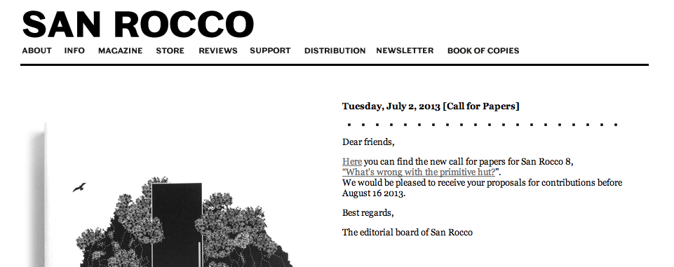
I remember vividly last year on a ferryboat crossing the IJ when Arjen Oosterman – Volume’s editor-in-chief and the man who sits across from me every day – told me about doing a criticism issue. I was perplexed. Aren’t we already a critical magazine? Isn’t every issue we do somehow criticism? And what about the handful of architecture magazines I read precisely for their critical content, including San Rocco, OASE, and Log?
On the ferry crossing the IJ https://t.co/86ApUIR9wE
— Brendan Cormier (@BrendanCormier) May 27, 2013
Turns out being critical and doing criticism are two separate things: Arjen was specifically referring to the lost art of building review – assessing and criticizing real built stuff. In Volume’s decision to go ‘beyond architecture’ as a method for expanding the conversation, we tacitly abdicated discussing specific buildings – and so it seems did many other critical magazines. In the absence was a landscape of press release journalism, where the descriptions of PR departments fed directly into the blogs and glossy rags that still discuss new buildings. Arjen was specifically interested in the feedback loop that criticism used to/should play vis-à-vis practicing architects. If negative critique had vanished, replaced by self-promoted advertorials, how were architects to infer what constitutes architectural quality?
We weren’t alone in questioning this problem. In fact it seemed like every major publication had also attempted to tackle it. OASE released an issue straightforwardly called ‘What Is Good Architecture?’ Arch+ had an issue called ‘Krise der Kritik’. And when Joseph Grima took the helm at Domus he initiated three roundtable discussions in New York, London and Milan called ‘Critical Futures’.
As far as themes go, this was a bruiser full of potential pitfalls. The first was the danger of perpetuating a tone of navel-gazing commiseration on the part of professional critics unable to adapt to a new critical environment. Writers with allegiance to traditional print complained about digital publishing, academics complained about the rise of unprofessional bloggers, and everyone abhorred the bottom half of the internet: namely the comment section. The second danger was implicating ourselves in the topic we were discussing. Volume enjoys a fair amount of critical distance in the topics we discuss, a liberating naivety in discussing issues that prior to the issue we knew little about – synthetic biology and the internet of things, to name a couple. This gave us a freedom to ask stupid questions, make connections, and hopefully provide fresh viewpoints. But with criticism we were supposed experts, adding a self-imposed caution to what we wanted to say.
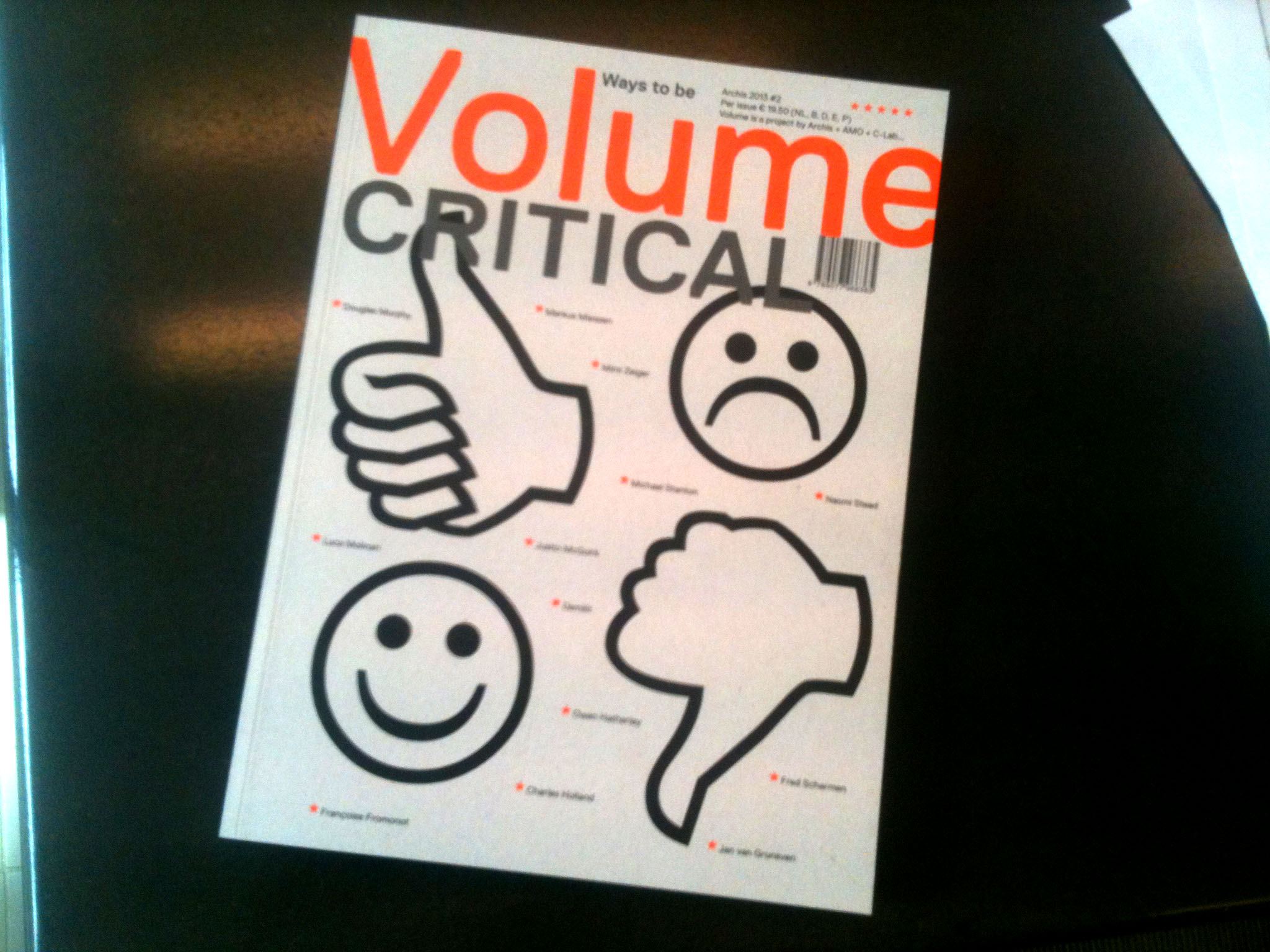
As a possible way out, we agreed to provide a positive spin to the issue. This would not lament the death of criticism, but acknowledge its changes and look for ways forward. To do so, it was necessary not to just look at the problem of evaluation, but at the whole ecosystem of architectural broadcasting and the different ways we can communicate critical thought. Thus we resolved very early on to call the issue: Ways To Be Critical.
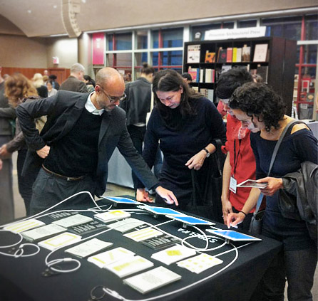
One other note about this phase, most of our themes get hashed out between the three of us in the office – me, Arjen, and Lilet – over some extended rambling conversations. But with this one, we went an extra length to hold group meetings, inviting local friends and people involved in criticism to test out our ideas. It was incredibly helpful, if not some good social fun, and I hope we continue the practice in the future.
Tapping the Network
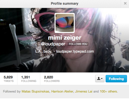
With the title set, and our basic goals and intents laid out, it was time to seek out contributors. Understanding how a magazine seeks out content is another great mystery I was confronted with when starting out at the magazine, and effectively tapping the network is still something to be improved. Usually we have some initial wish list of people in mind as the theme is being conceived. An advantage with this issue was because it was so close to what we do everyday we were already familiar with many people in the field. My twitter feed is filled with good critical writers, and this was a great opportunity to reach out to many of them. Mimi Zeiger, Demilit, Owen Hatherley, Douglas Murphy, and Charles Holland were on the list mostly because of their reputation for good 140-character-isms (and of course their even better skills in the long form).
Others were found from specific pieces they’d previously written or projects they’d done. Steve Parnell had an excellent show on the history of architecture magazines at last year’s Venice Biennale; Sergio Miguel Figueiredo wrote a great piece on the NAi in Domus. For the interviews, there’s an added push to find great conversationalists, and a selfish interest to be able to grab an hour of their time. Justin McGuirk, who discussed digital publishing, Strelka Press, long form writing, and his own thoughts on criticism, and Markus Miessen, who discussed how criticism might move from a written practice to a hands-on practice, thankfully provided.
Other contributors are found in a more circuitous manner. Some are found through recommendations from other people, and others through casual conversations about the issue. Some are unsolicited emails after hinting what the issue will be about via our website, facebook updates and tweets. It’s all very accidental. With this issue, Rory Hyde, one of our editorial advisers, was particularly active in getting the message out in Australia, and we received great contributions from Justine Clark, Paul Walker, Naomi Stead, Timothy Moore and Amelia Borg.
One tool we eschew, that many other magazines use, is the open call for proposals. The reason for avoiding it has never been explicit, but I suppose an advantage to working in the way we do is that we can start to adapt what we’re looking for as content starts rolling in – as opposed to an open call where all the pitches get dumped in your inbox once the call deadline has been reached.
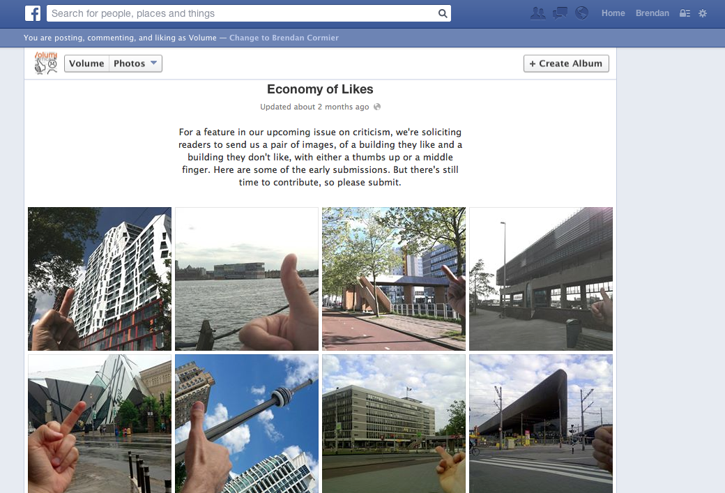
With this issue we were also very interested in somehow involving the network of readers in the content – especially since so much of the debate about criticism revolved around the opening up of criticism to the masses. We like to think we have a very intelligent cosmopolitan worldwide audience (albeit thinly dispersed), yet our contact with our readers is so limited – could we improve that somehow? In our interview with Justin McGuirk he used to term ‘economy of likes’ to refer to the way things are evaluated on social media platforms like facebook. We wanted to reflect that (for better or worse) in the pages of Volume, so we put out a call on our website for photo submissions of buildings people liked and hated, placing either their thumbs up or middle finger in the frame depending on their disposition.
Crowd-sourcing content is much harder than it seems, and the original deadline for submissions came and went with a pathetic two submissions in our inbox. We doubled-down and started a more aggressive strategy, first appealing to friends for favors, and once we accumulated about twenty or so, we started posting them on facebook. The strategy worked, and once the visibility on facebook spread we started getting a steadier stream of submissions. While it’s admittedly a blunt kind of content, I maintain it was a worthwhile exercise forcing our readers to take a position on a building. (although they were free from the obligation of justifying their position)
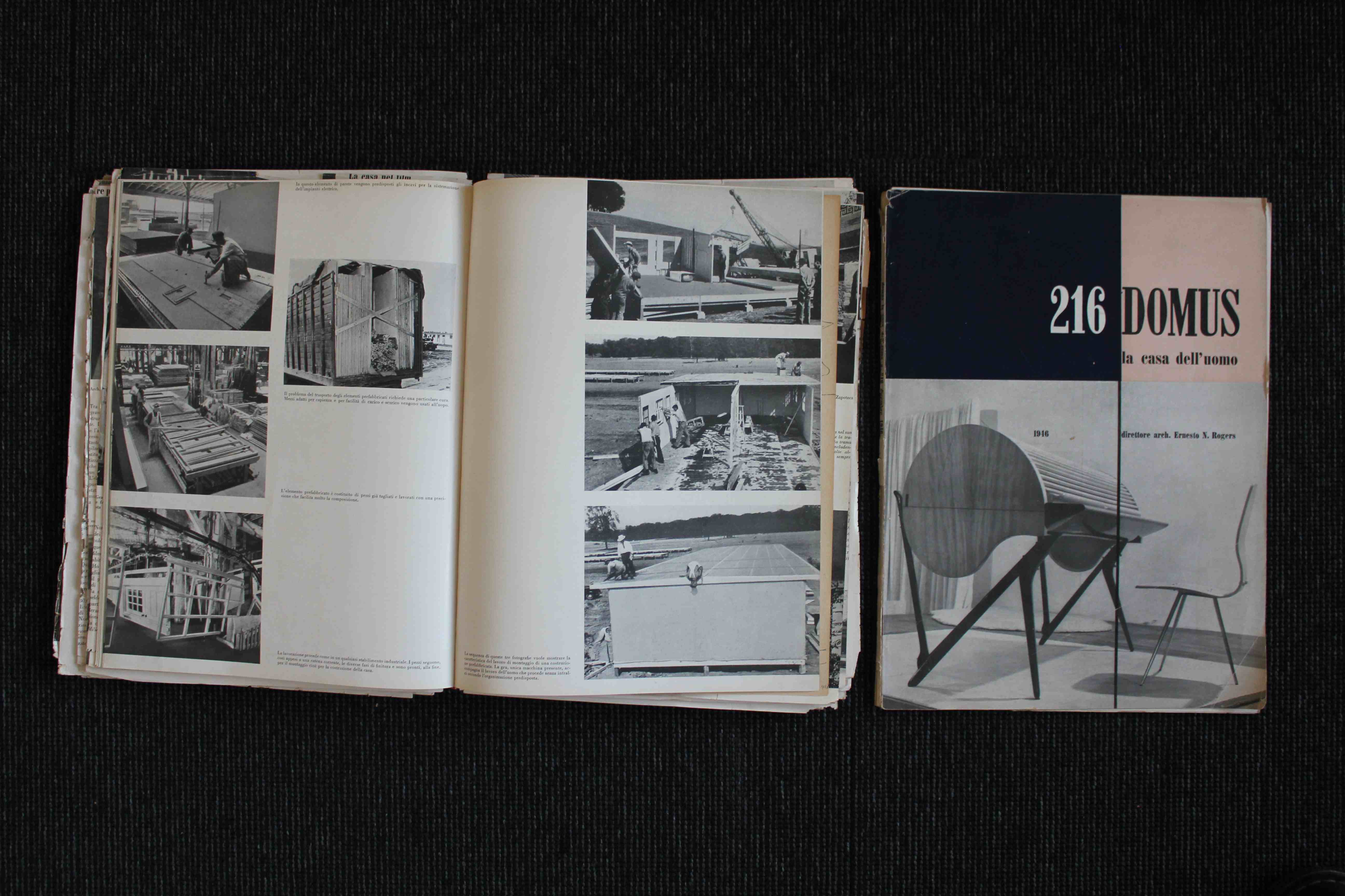
As a side note, my own interest in how networks are used was enlightened by a short anecdote included in Fabrizia Vecchione’s piece about the history of Domus. Back when Gio Ponti was running the issue, he always included the addresses and telephone numbers of contributors on the back page – a way to enforce the links in the network allowing people with similar interests to get in touch with each other. As an evolution of that, under Grima’s period, the twitter handle of each contributor was included. Perhaps that’s redundant in an era of ‘let me google that for you’, but it still seems like a nice touch.
Structure, Rhythm, and Narrative
As the contributions start rolling in and we have a vague idea of what to expect from the meat of the content, we start to strategize what the structure of the issue will be and how the editorial narrative will go. A pet peeve of mine with most critical magazines is that they establish a brief, open it up to contributors, and simply pile the contributions on top of each other until the page count is full. These issues can still produce some amazing individual content, but the sum never amounts to being greater than the parts. On the other hand the problem with thinking about structure and editorial narrative is that it is time consuming, involves a lot of extra writing and research on our part, and usually the ambition to provide a fleshed out editorial layer is never fully realized because of deadline pressure and page count.
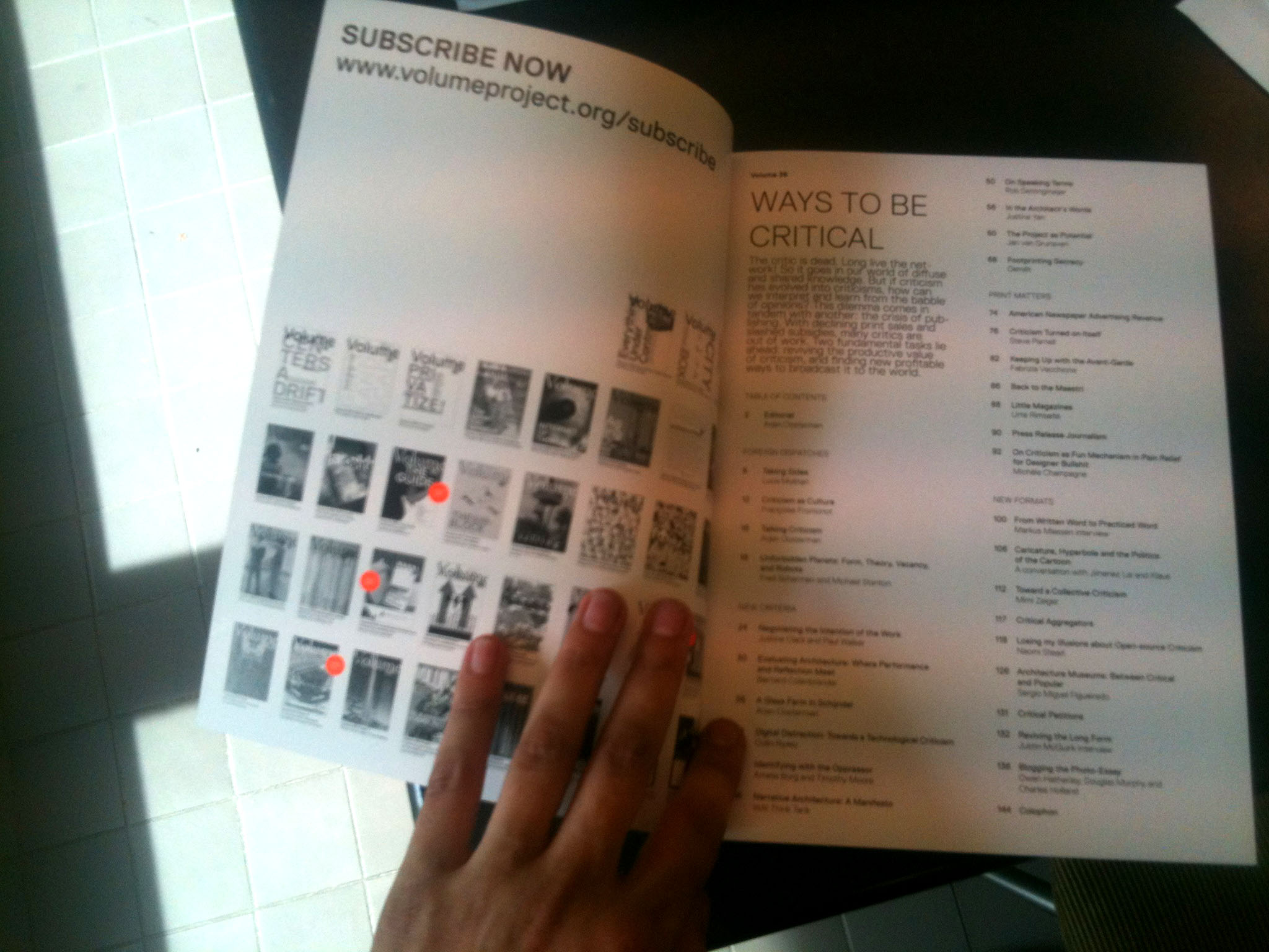
With Volume 36 there was already a clear split in the content we were looking for, so establishing a structure was relatively easy. The first half would seek out answers to the question of evaluation, called New Criteria, while the second half would explore new formats and outlets for being critical, called New Formats. But as we were collecting works, the need for two new sections arose. Arjen was specifically interested in regional attitudes and scenes for criticism, and we received two great pieces that explored the critical scenes in Italy and France from Luca Molinari and Francoise Fromonot respectively. Another contribution from Fred Scharmen and Michael Stanton was firmly rooted in American theoretical debate, so we also saw it fit for this regional criticism section. A recent debate about criticism that took place here in Holland was also loosely recorded and we captured some of that, and ended up calling the whole section Foreign Dispatches – a way to remind ourselves that critical scenes are still intensely local, full of personal relationships, and intimate encounters with real physical architecture, that feed into our knowledge and attitudes.
In our discussion of formats, printed publications and their seeming decline was such a large topic that we also thought it could use its own section as a pre-cursor to our New Formats section, so we squeezed out a mini-section with the optimistic title Print Matters.
To a certain degree, these sections are a small conceit, with many of the contributions crossing over into multiple different terrains. Mimi Zeiger and Noami Stead’s contributions discussed the possibility for online critique through twitter and product reviews, and in doing so, specified suitable kinds of criticism for each format. The Foreign Dispatches inevitably discussed formats, and our interviews segued into subjects that spanned to whole issue. But the sections do provide a useful amount of guidance and structure for the reader, which for me justified the conceit.
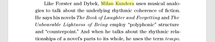
I’m also very interested in the idea of rhythm in a publication, something I first heard about when reading Milan Kundera discussing his own writing. He consciously thinks about the length of his chapters and the staccato of his sentences, as if they formed several different movements of a symphony, varying short passages with longer more reflective passages like moving from an allegro to an adagio. I don’t claim we have a perfect system for this, or a theory as to what constitutes a good rhythm for a magazine, but there was some effort to intersperse the longer essays with shorter ones, and to create interludes to break up the heaviness of the issue.
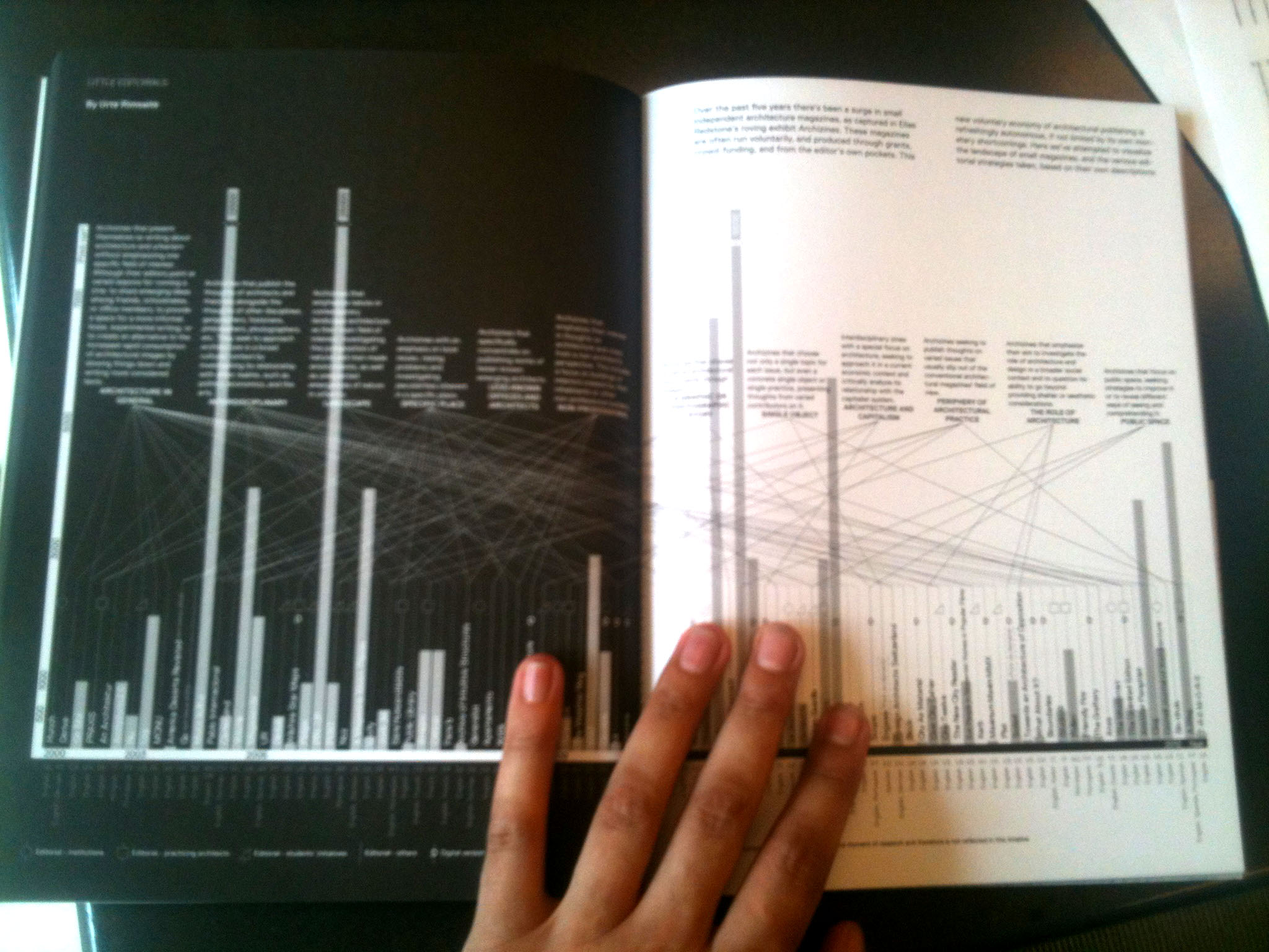
Interludes include graphics, such as the fantastic spread by our intern Urte Rimsaite which attempted to categorize the editorial ambition of the small magazines featured on Archizines, and short anecdotal pieces. One such piece was an account of the recent departure of Joseph Grima from Domus, where we included the discontent registered by Twitter users concerning the move to re-instate an old boys club at the magazine after Grima’s departure. Here was a happy accident in action. We had initially reserved some pages for an interview with Joseph and after several comically failed attempts at an interview, including internet fallout during a skype with him in Urbino, we were left with some empty pages and no interview. Compiling tweets was a last ditch effort to discuss the topic, and in the end was a nice way of crossing the digital divide, bringing together dispersed messages into a coherent whole. Tracking conversations that happen online and bringing them into print is something we’ve resolved to do in the future.
Aside from breaking up the heaviness of the magazine, these interludes provide a second useful function, as multiple entry points into the magazine. The typical way someone picks up a magazine is to first flip through it. They almost always stop at the big graphic or photographic spreads, and then back up if their interest is piqued. Without these spreads, the publication feels impenetrable.
Zero Shades of Grey
I’m breaching into design territory already, so we might as well get to it. The design of the magazine usually takes up the last three weeks of production, and is handled by Irma Boom and Sonja Haller. We are really blessed to have two of the best graphic designers in the country working on the issue, and they always pull off smart design approaches to the themes we give them. Here their concept was simple: a black and white issue, with white text on black pages on the left side, and black text on white pages on the right. Polar arguments; seeing the world in black and white. The concept doesn’t need much explanation.
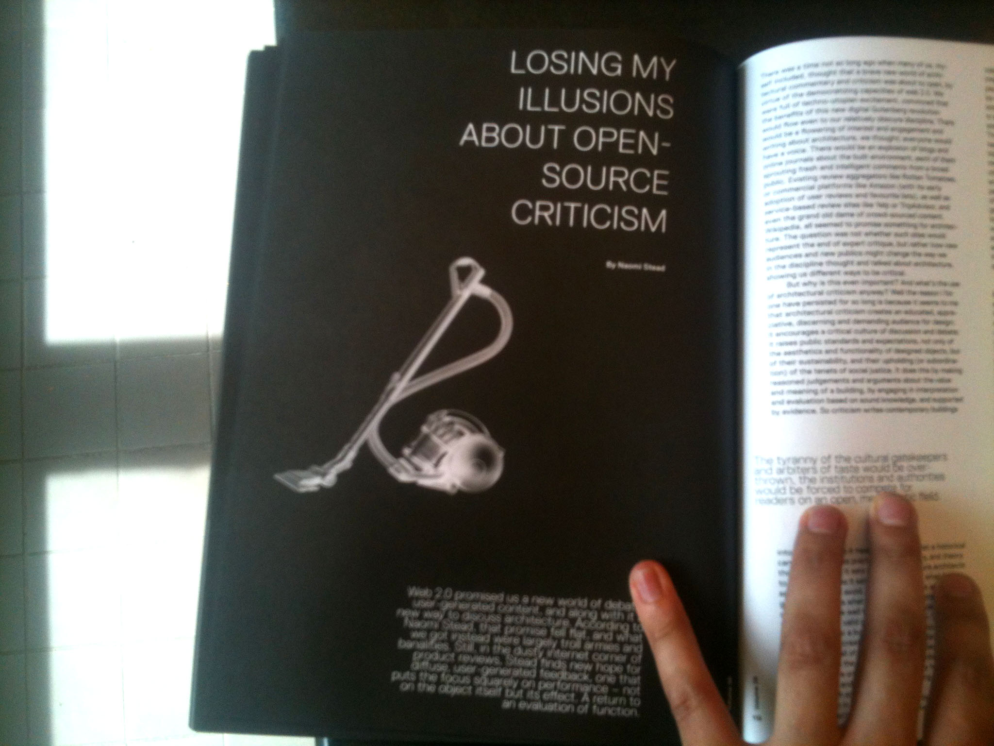
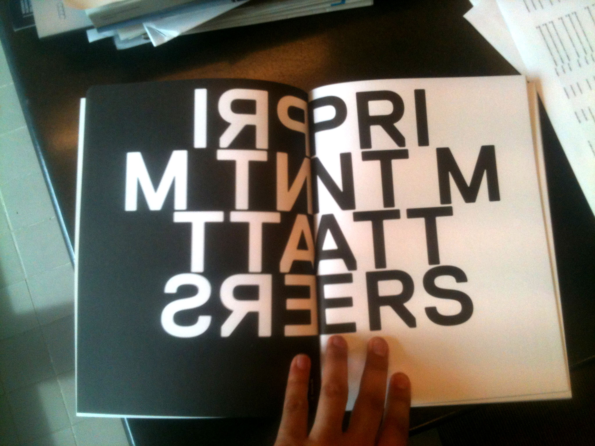
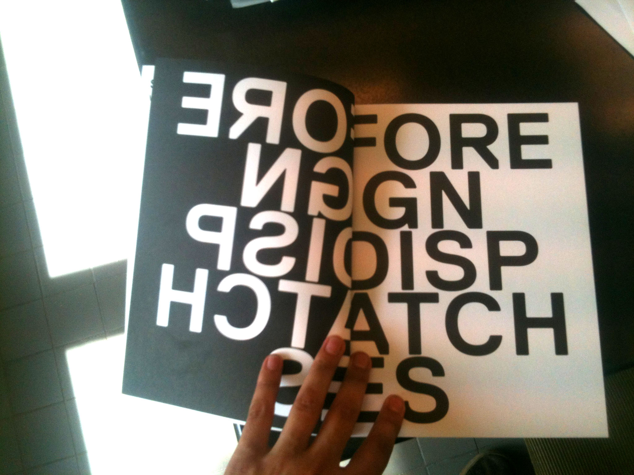
One thing we tried to avoid with this issue was cramming it full of text. This is a common complaint about Volume – that it is too full, making it an intimidating experience and a deterrent to reading. So we tasked Sonja with finding space, and she came up with a template which reserved a full page for just the title and the lead-in. I try to estimate the page counts of each article based on the word count, and this graphic strategy pushed the page count way beyond what I was expecting. It meant that we had to kill a lot of the interludes and editorial narrative I had originally hoped for, but the clock was ticking, and as that content hadn’t yet been produced, it was easy to erase it from the spreadsheet. We also reserved a generous spread for each of the section dividers to add more space, and Sonja introduced a nice mirrored effect on the section titles.
An aside about the Economy of Likes, my initial idea for the thumbs up and middle fingers was to treat them as a flipbook. Discretely tucked in the bottom corner of the page they would occupy every page of the issue, and as you flipped through the issue, they would act as mini-flipbook of hand gestures. The problem was I was greatly insecure if the effect would work or if we would get enough photo submissions to fill every page. We ended up getting enough photos, but I hadn’t insisted to Sonja that we do this (only hinted it as a possibility), so her initial proposal grouped the photos on separate pages. By the time we had enough photos we were already too deep into the design phase, and the original idea simply wouldn’t have worked with the layout we now had. Noted for the future, if I really want a specific design tactic, I need to talk about it from the start. Maybe we’ll include a flipbook in a later issue.
Nobody Buys an Ugly Cover
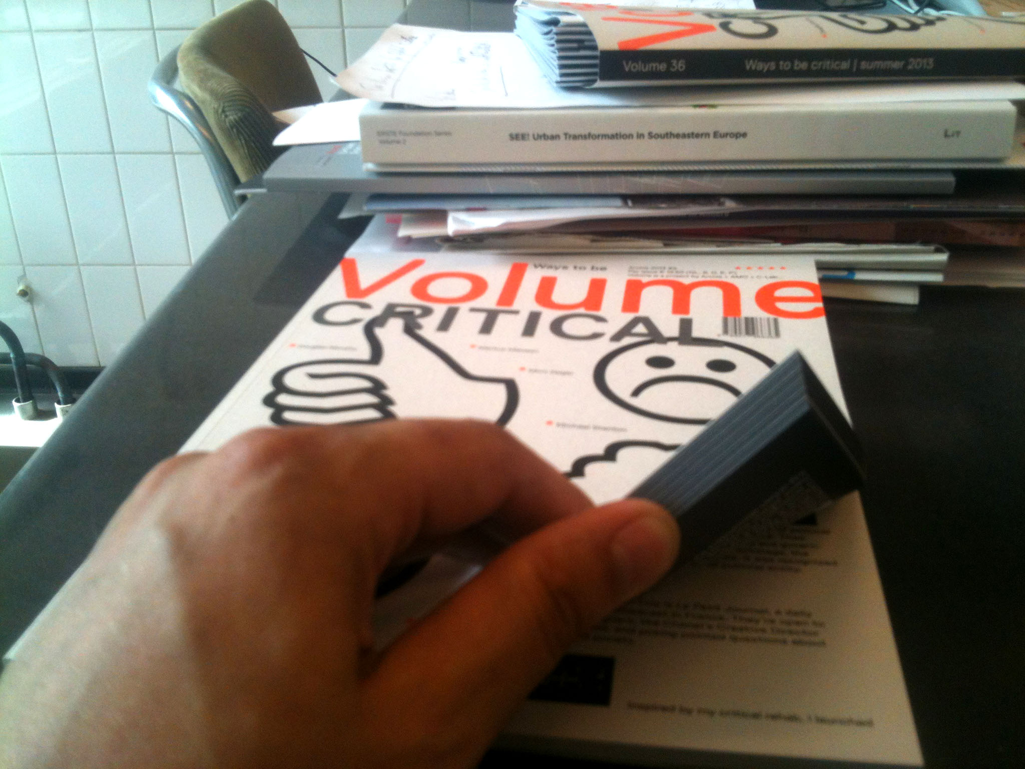
Irma always takes on the responsibility of designing the covers. When we interviewed her last year for the Volume blog, she emphasized the importance of designing covers – nobody wants to buy something with an ugly cover. We had recently switched to a typographic strategy of cover design, big bold colorful letters and nothing else. We followed this rigidity for the first three issues, but started to appeal for something else. For Volume 33: Interiors we included Playboy bunnies in the bottom corner, standing in front of Expo 67, to advertise the Beatriz Colomina edited Playboy insert we were featuring. For Volume 35: Everything Under Control we introduced a bacteria stain. For this issue, Irma brought the type to the background and introduced giant icons of happy/sad faces and thumbs up/down. It was punchy and to the point, with a bit of humor for a heavy topic, so there was little debate. The only problem was that it was all in black, and sitting on a grey-ish paper it would have looked grim, so we asked if she could introduce a color. She immediately suggested fluorescent orange. We were sold.
That’s about it. If this were indeed a voice-over commentary on a DVD the director and producers would normally thank you for listening and hope you found it insightful. Until next time.