VOLUME’S ARCHIVE: ON MONEY. ‘SELLING MONEY’ FROM VOLUME #3
February 17, 2023
Just as you need money to buy architecture, you need architecture to sell money. There is hardly a currency in the world that does not make some use of architectural symbols. Some banknotes, such as the US dollar, feature civic monuments (e.g., Independence Hall, the White House), while others, religious sites, skylines, cultural destinations, and historic ruins. Architecture is stable, material and durable. It inspires trust and security. In contrast, money is volatile – its value is mercurial and abstract, and banknotes themselves are flimsy. Since the suspension of gold convertibility and the implementation of floating exchange rates, architecture’s role in grounding currency systems has only increased. It projects an air of confidence. It transmits the idea of stability within the value-fluctuating arena of international monetary exchange. The best and most recent example of this is Europe’s legal tender.
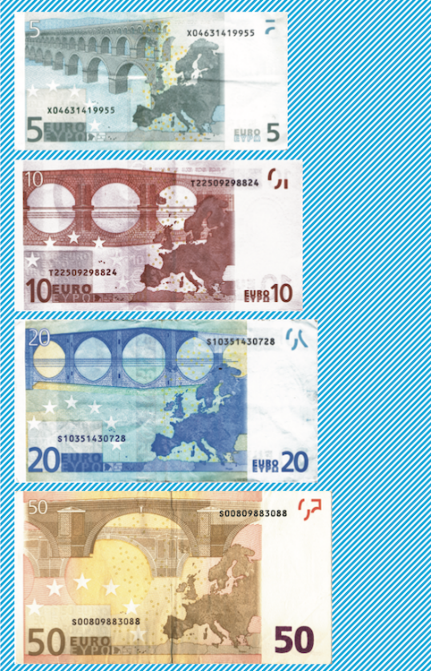
Architectural symbols are the face of the euro banknotes. In 1996, the European Monetary Institute (EMI) invited graphic artists from throughout Europe to submit designs that dealt with one of two themes, ‘Ages and Styles of Europe’ or ‘Abstract and Modern.’ The vast majority of entries included architectural monuments.1 Depictions of famous historical figures were disfavored because it was worried that the notes would be construed as nationally biased. Wolfgang Amadeus Mozart does not appear in any of the designs because he had written Masonic music. Leonardo da Vinci was disqualified from consideration because ‘it was feared that the old tale about his homosexuality might be dragged up.’2 One of the banknote entries included a group of scuba divers (the technology was invented in Europe), and still others sought to include ‘ordinary’ and ‘everyday’ people. But in the end these were rejected in favor of a proposal that was not bound to a nation or locale – a design that was geographically unspecific and hence, more ‘European.’ While many criticized this very fact, it may be the most appropriate employment of architecture to serve the EMI’s ambitions, and a choice that reflects the Institute’s keen understanding of architecture as tool of communication.
Many of the euro proposals featured such iconic buildings such as Hadrian’s Villa, Le Corbusier’s Villa Savoye, Otto Wagner’s Postal Savings Bank, Mies van der Rohe’s Barcelona Pavilion, Gerrit Rietveld’s Schröder House, and even a rendition of John Hejduk’s Diamond House. As validating as it might have been for architects to have master works commemorated on the new banknotes, none of these designs were chosen for the fact that they misunderstood the ‘project’ of European unification. Europe is not about a specific ‘identity’, ‘place’, or even a ‘culture’. It is rather about being everything, everywhere, all the time. Never turning off, always broadcasting; always changing hands. In his Community and Civil Society, Ferdinand Tönnies defined community as an organic, even genetic bond that links people to one another and to nature at large. It is irrevocably connected to the thought that a given region could be rendered totally unique from every other. For the EMI, it signifies something altogether different. In the era of the euro, community means communication. It means transgressing all borders, including those that are geographical, historical, and racial in nature.
The only person to grasp this principle was Robert Kalina, the graphic artist of the Austrian National Bank. Kalina was originally a juror on the banknote selection committee and was only later invited to produce a design. His concept for the banknotes was quite simple: first, design portals and windows on the front of the banknotes and bridges on the back, as these are motifs that connote openness, exchange, and movement. Second, and more importantly, every image should be ‘completely fake, and not actual places’.3 Although Kalina cribbed the drawings from one particular book, Bridges: 3,000 Years of Defying Nature, they were altered in order to appear generic. That is, only by counterfeiting actual bridges and windows was it believed that the public’s trust could be won. As one of the jurors on the euro selection committee put it, ‘[a]s you can see, the doors are an evocation of different centuries, they look real, but they are not! No country can be frustrated because these doors belong no where!’4
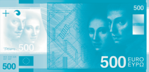
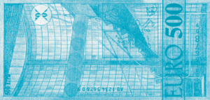
Released in 2002, Kalina’s notes are by far the most widely broadcast images of architecture in the world. Each denomination corresponds to a historical epoch: there is a Classical portal on the 5 euro and a Modern façade on the 500. Examples from the Romanesque, Gothic, Renaissance, Baroque and Rococo, and ‘Age of Iron and Glass’, appear on the 10, 20, 50, 100, and 200 notes, respectively, showing in seven steps a short-hand history of European innovation. The images are finely detailed, such that columns, capitals, pedi- ments, mullions, and other ornaments are readily legible. They are all distinctly ‘European’ insofar as they challenge us to morph, transform, and transfigure. Could Asia be in Europe? What if Berlin were in India? This seems to be precisely the kind of questions that the euro wants us to ask. Indeed, one incident exemplifies the EMI’s intention to re-conceptualize the euro zone territory. In 1997, when Kalina’s design was first selected, the Institute had hoped to have an Indian pontoon bridge on the 5 euro note. They might have even gotten away with this had the figures in the image not been depicted with turbans. As one person close to the situation put it, ‘The turbans thing was quite funny… The artwork issued for the original designs was not high resolution, and although it was clear that the two pictures were the same, I hadn’t actually noticed the turbans on the people. When I got to the BBC TV studio to make the original broadcast, [the BBC] had blown up the artwork to poster size so that [we] could walk around dis- cussing them. It was actually [the BBC’s] Jeremy Paxman who pointed the turbans out to me. They had not been removed, and became something of a clincher for the bridge being in India (not, as far as I am aware, a European country!)’.5
The history of the euro banknote is a lesson in circulating ideas. The EMI’s selection of generic structures over specific buildings underscores the Institute’s recognition and application of architecture as a repository of concepts. The committee understood that more meaning could be culled from architecture’s vocabulary of resonant typological information than from any set of real buildings. They aimed to confer upon the Euro the metaphorical value of the whole category of the building type. In other words, to convey values they felt were important, they deployed the imagery of the type, and its associated symbolism and history. As the world becomes more abstract, metaphors that suggest ‘grounded-ness,’ and which at the same time can introduce palpable concepts, rise in demand. Architecture sells because it canauthenticate the inauthentic. And in the euro’s case it can authenticate speculation on multiple levels, including currency exchange, popular identity, and geo-politics. The bigger questions to ask are: how do the abstractions – economic, social, and legal – that govern our daily lives transform the definition and function of the architect? And how can the architect question and influence these abstractions? This can be done at the scale of individual buildings, but also at a larger scale of discourse and discussion, by circulating the image of architecture and hypothesizing new meanings and propositions.
To see images of the euro banknote competition entries, visit http://www.bankofgreece.gr/en/exhibition-euro/start.html.
Quoted in Alexander MacLeod, ‘Design of Europe’s Banknotes Panned as “Funny Money”’, Christian Science Monitor (December 26, 1996).
Robert Kalina, ‘Das Design der Euro Banknoten’, unpublished press statement, 2001.
Correspondence with euro banknote juror Gerard Caron Scopes, December 14, 2001.
Correspondence with Russ Swan, November 29, 2001.